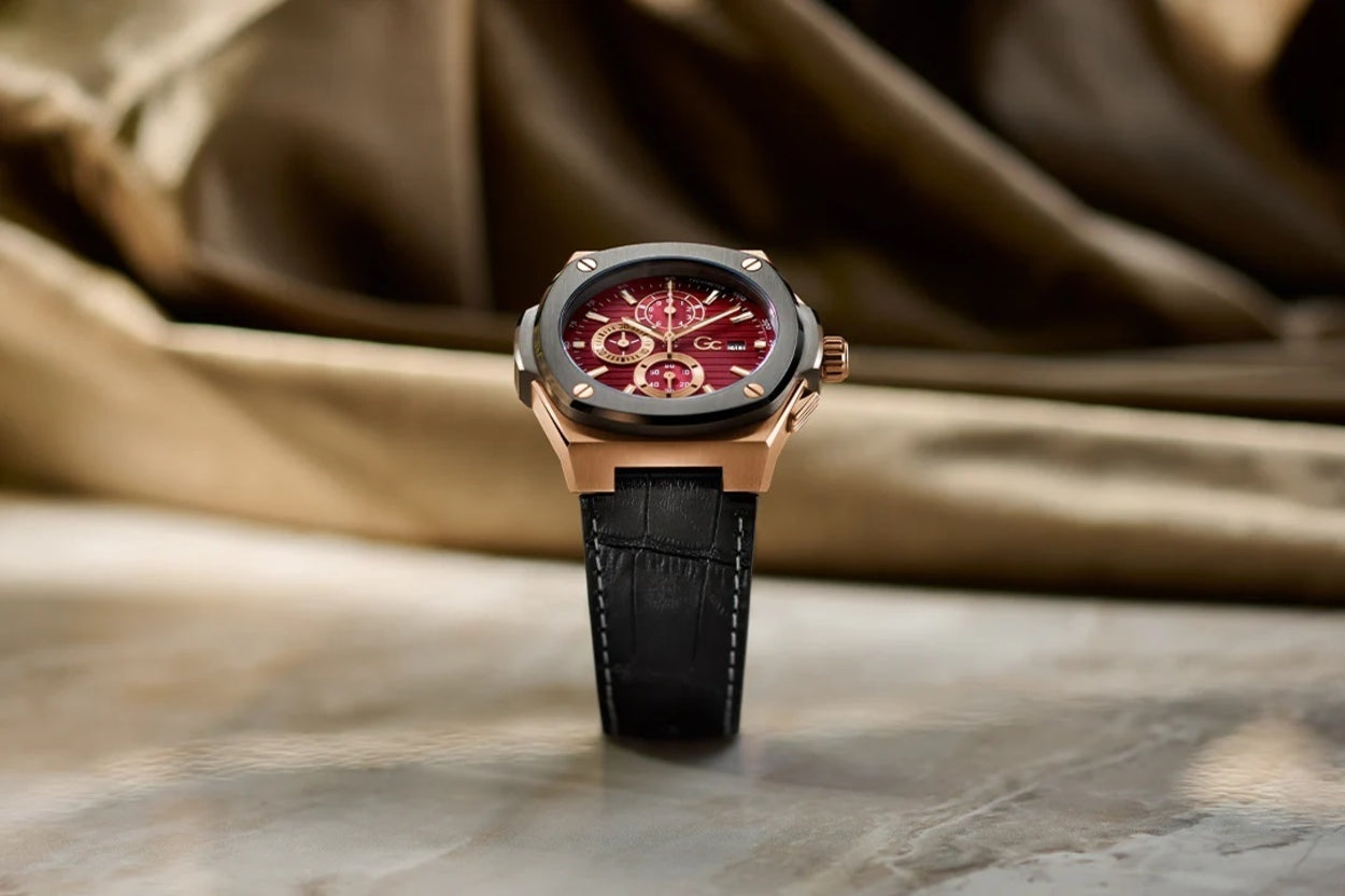
Colour is one of the main factors that helps us determine what looks good. When selecting a watch, having the colours that suits your skin tone, attire and lifestyle ensures a look of prestige and can be subtly stylish. Each person has a unique colour palette that they prefer. The shape, size, material and functionality are taken into account but often the choice of colour is overlooked.
Understanding the role of colour theory can aid you in picking out the right watch to compliment your aesthetic. In this article we will take a look at how colours play a big role in watch design.
Understanding Color Theory:
Prior to exploring the more finer details of colour theory in watch design, it is important to acquire a good understanding of the interplay of colours and their influence on human emotions and perception.
Shades of colours can be categorized into three main groups: warm, cool, and neutral. Shades such as orange, yellow, and red create feelings of energy, passion, and thrill. Chill tones such as purple, green, and blue are calming and often associated with the outdoors. Neutral colours such as black, white, grey, and brown not only serve as a background but can also be used to highlight or counterbalance different colours.
Hue, saturation, and value are further concepts that colour theory investigates. Value describes the lightness or darkness of the colour, saturation the intensity or purity of the colour, and hue the actual colour. These colour theory concepts are applied in watch design to provide a symmetrical and aesthetically beautiful combination.
Colours' Emotional Effect on Watch Design:
Emotions and sentiments of all kinds can be evoked by colours. It is impossible to overlook the emotional impact that colours have on watch design. Different hues provoke different reactions from wearers and can affect how they view the clock.
Red, for instance, is frequently linked to strength, courage, and power. A crimson dial, bezel, or strap may make a bold and commanding statement in watch design. Conversely, blue is frequently linked to peace, tranquillity, and trust. A blue dial on a watch can convey dependability and assurance.
Green also represents freshness, growth, and nature. A green watch could represent a love of the outdoors or a connection to the environment. Vibrant and energizing colours like yellow and orange are perfect for sporty or adventurous watch designs.
Moreover, neutral hues like grey, white, and black are frequently linked to grace, timeless appeal, and adaptability. These hues can be utilized as a blank canvas to bring out the best in other design components or to produce a subtle, minimalist look.
Combinations of Colors and Contrast:
A combination of colours is just as fascinating as contrasting colours. Multicolor watches stand out and can be easily combined with many different types of looks, whether it be for an event or just casual wear as well. A balanced and visually pleasing arrangement of colours can improve the overall appearance.
The colour wheel is one colour theory concept that is frequently applied to watch design. If you refer to a colour wheel, you will notice various hues. While similar colours look good together, you can also match the hue with one from the opposite end of the wheel.
On the colour wheel, complementary colours are opposite one another and provide a lot of contrast. For instance, the visual impact of red and green or blue and orange is startling. A feeling of energy and brightness is frequently produced by complementary colour palettes.
Conversely, analogous hues have similar undertones and are located next to one another on the colour wheel. The blend of colours in this colour scheme is more subdued and harmonious, facilitating a more seamless transition between hues.
Three colours that are equally spaced out on the colour wheel are used in triadic colour schemes. With each colour interacting with the others, this combination produces a composition that is lively and energetic.
The Role of Color in Enhancing Functionality:
Apart from its visual impact, colour theory also contributes to improving a watch's readability and performance. Making the right colour choices can help with legibility, which makes the time simpler to read and understand.
Clear visibility can be achieved by using contrasting colours for the backdrop and markers, or for the dial and hands, particularly in low light. For example, good contrast and legibility are provided by silver or white hands on a black dial. Similarly, reading in the dark is made simple by luminescent materials like Super-LumiNova.
Color Theory in Brand Identity:
Beyond specific watch designs, colour theory is essential for creating a brand's identity. Brands frequently link particular colours to their target market, image, and values. Numerous product lines and marketing materials, including watch designs, use this colour identity.
For instance, Rolex has created a unique brand identity with its trademark green hue, which is present in several of its models, including the Daytona and the Submariner. The brand's link with greenery serves to uphold its reputation for luxury, distinction, and dependability.
Conclusion:
Beyond mere aesthetics, colour theory is an essential component of watch design. A brand's identity can be defined, emotions can be evoked, and functioning can be improved by the choice and arrangement of colours. Watch designers may make watches that do more for their wearers than just tell the time by grasping and using the principles of colour theory.
Colour theory is an important instrument that enhances the overall success and appeal of a watch design, regardless of whether it's a bold and dynamic sports watch or an elegant and timeless dress watch.
Check out all the various colours of reputable brands available on Just Watches.